

Learn the fundamentals of data slicing and visualization in this informative tutorial on data analytics.
Understanding Data Slicing
Data slicing is a technique used in data analytics to extract specific subsets of data from a larger dataset. It involves selecting and isolating a portion of the data that is relevant to a particular analysis or investigation.
By slicing the data, analysts can focus on a specific dimension or attribute and gain insights into its patterns, trends, and relationships. This process helps in understanding the data in a more granular way and facilitates a deeper understanding of the underlying patterns and structures.
For example, if we have a dataset of sales transactions and we want to analyze the sales performance of a specific product category, we can slice the data to extract only the records related to that category. This allows us to analyze the sales trends, customer behavior, and other relevant factors specific to that category.
Now let's do some hands-on practice using the Mock Data attached to this article :
We are using a sample data of an E-Comm firm operating in India and below is a Snap shot of the data.
Fig. 1 : Snapshot of the Data in .CSV file
Steps to perform data slicing and Visualisation
Step 1:
Login in to your Free Talktodata.AI account and upload the data set. Below is the screenshot for reference.
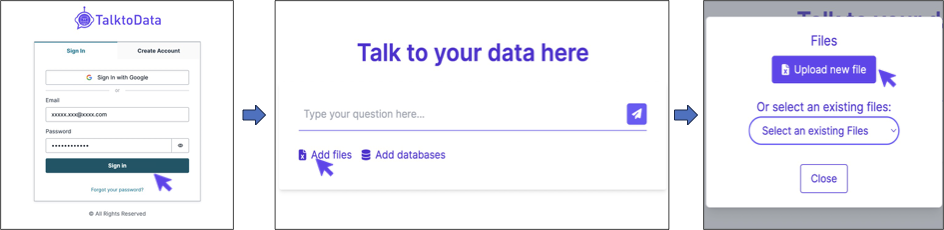
Fig.2 : Steps to Login and Upload the sample data file
Step 2:
Asking the Tool to perform the Analysis. For example, i'm using the command
"Can you give me the city with highest number of orders whose courier status is shipped?"

Fig. 3: Asking the Query
Step 3:
Now you can choose from the list of suggested questions or enter questions for further analysis. In this tutorial, we are going to see how we can get the data Visualisation based on our previous result.
Here i'm using the command
"Can you give me a bar chart of city wise orders whose courier status is shipped?"

Fig. 4 : Data Visualisation
There you have your data slicing and data visualisation done in less than a minute. To ensure accurate results, it's important for us to ask the right questions.
Here is a simple guide on how to ask the right questions
You can further enhance this visualisation by asking the assistant to add data tags, change graph colours, add an average line etc. Now go-ahead and start your AI Assisted Data Analytics Journey.
Click here to Download the sample data set.
For any queries or support, please visit https://talktodata.ai/