Explore the Power of TalktoData.AI to generate dashboards with insightful graphs and data interpretations
Learn how to generate & Interpret BI Dashboards with one click!
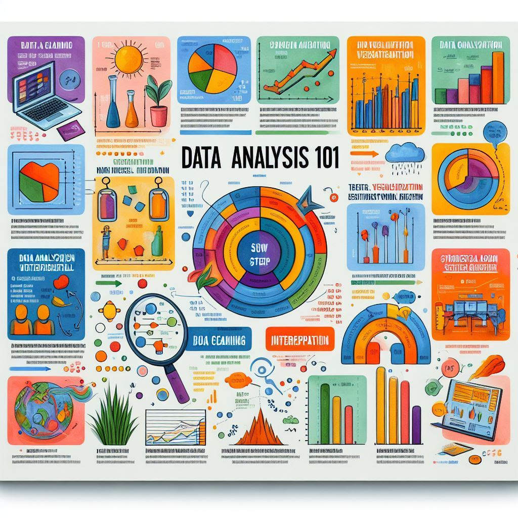
A BI (Business Intelligence) dashboard is a visual interface that displays data, key performance indicators (KPIs), metrics, and other essential information in an easy-to-understand format. BI dashboards are used by organizations to monitor business performance, track goals, and make data-driven decisions.
BI dashboards are widely used across various industries, including finance, marketing, operations, and healthcare, among others. They are typically part of larger BI platforms or software solutions like Tableau, Power BI, or Qlik.
Earlier, Data teams had specialist PowerBI or tableau developers who build these dashboards for Business and operations use. But for a simple dashboard, you no longer need to depend on your Data teams or learn these softwares.
You can generate your own dashboard with just one click of a button on TalktoData.AI.
Please use the attached sample data set to follow along with this Tutorial
Fig. 1 : Snapshot of the Data in .CSV file
Steps to perform Analysis on this data
Step 1:
Login in to your Free Talktodata.AI account and upload the data set. Below is the screenshot for reference.
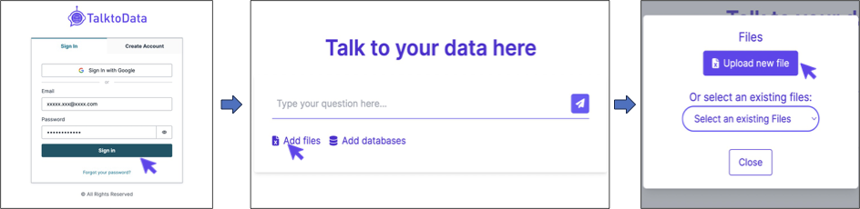
Fig.2 : Steps to Login and Upload the sample data file
Step 2:
Click on the "Auto Generate Dashboard using AI" at the top right corner of your screen. That's it!

Fig. 3: Auto Generated Dashboard
Step 3:
Now lets interpret these graphs for a quick overview and list down basic observations:
- We see that the variation in movie ratings over the years have more or less stabilised
- We see the top 5 movie genres till date. You can further analyse this data by looking at the variation in genres for every 10 years
- ~57% of the content is "R" rated!
- Reality TV Genre has the least variation in ratings. You are going to be average! (With data anomalies like this, you need to double check the data again. Look at the total number of reality TV entries in the data for example)
With these basic observations, you can now set out to deep dive on interesting insights!
Or generate standard reports for your enterprise use.
Now go-ahead and start your AI Assisted Data Analytics Journey.
Click here to Download the sample data set.
For any queries or support, please visit https://talktodata.ai/
